Do animated websites convert better, and how
First mechanism: it buys the second glance. Almost every buyer sees four or five suppliers in a category, on the same afternoon, and the sites blur because they were built from the same handful of templates. A site that moves in a way the others do not is the one still in the tab an hour later, and being in the tab is a precondition for everything else.
Second: motion is a capability claim you cannot fake. Anyone can write “we build exceptional digital experiences”. A page that responds properly, holds sixty frames on a mid-range phone and does something clever without breaking is a demonstration, and a visitor reads it as one instantly, without being able to say why.
Third: it carries information. Direction, cause and effect, hierarchy, state — motion that says something makes a page easier to use, and easier reliably converts better than harder. That mechanism is the least glamorous and the most measurable.
The first two are why an unusual site sells. The third is why a well-built one does. They are different arguments and most agencies only sell the first.
Different is a trust signal, up to a point
In categories where everyone makes the same promise, the promise stops carrying information and the execution starts. A visitor cannot evaluate whether your development is good; they can evaluate whether your site is, in about four seconds, and they will use the second as a proxy for the first.
That is not irrational. It is the only evidence available before a conversation, which is exactly why it works, and why proof placed beside the ask compounds with it rather than competing.
The limit is category expectation. A payments company, a law firm and a hospital are buying credibility, and unusual reads as risky there in a way it does not for a studio, a product launch or a brand with something to say. Different sells where different is safe.
The failure is not being too bold. It is being bold in a category that was quietly asking for competence, and nobody in the room saying so.
The condition: the words have to already work
Motion multiplies whatever the page is already doing. On a page that makes a clear, specific promise, it makes the promise memorable. On a page whose offer has to be assembled from four sections, it makes the confusion memorable, which is worse than forgettable.
This is why the sequence matters: the message, then the structure, then the screens. An animated site with unclear copy is the most expensive kind of failure in this business, because it looks like it worked.
The test is blunt and it takes a minute. Turn off every animation and read the page. If the argument still stands, the motion is amplifying something real. If the page falls apart without it, the motion was covering for the copy, and the copy is the actual project.
The combination that sells is all three at once: something to say, said in a visual language that is not your category's default, moving in a way that makes it easier to follow. Any two of the three underperform.
What it looks like when it lands
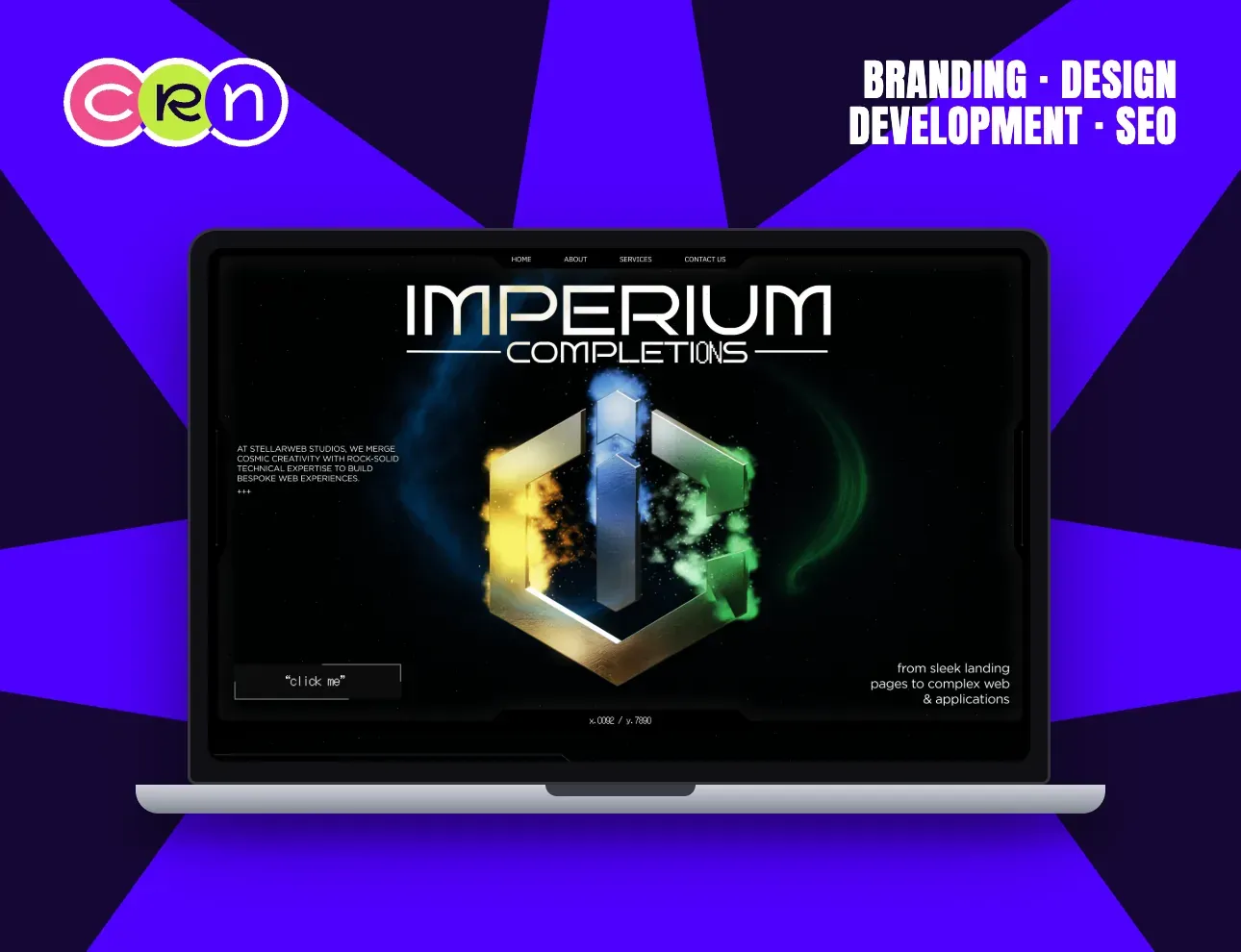
Imperium Completions sells bespoke web work, which means its own site is the portfolio. Its hero is a 3D emblem lit against a nebula — rendered for the web and weighed for page weight before it was made pretty, because a hero that proves capability by being slow proves the opposite.
Broz spends its entire first screen on one sentence at the largest size the viewport allows, with project thumbnails drifting behind the letterforms and two smileys standing in for the O's in “good”. Nothing on that screen is decoration: the size is the confidence, the drift is the portfolio, and the smileys are the temperature of the studio, all readable before the about page.
Both are unmistakable, and both would still make sense with the motion switched off. That is the order it has to happen in.
Questions we get asked
Do animated websites convert better than static ones?
Generally yes, through three separate mechanisms: they are remembered when a buyer compares several suppliers in one sitting, they demonstrate capability in a way a claim cannot, and motion that carries information makes a page easier to use. The third works everywhere; the first two depend on your category rewarding distinctiveness.
Does animation slow a site down and hurt conversion?
Only if it is built badly. Movement on transform and opacity is close to free; movement that changes width, height or position forces the browser to re-measure every frame, and that is where a mid-range phone loses it. The slow part of most animated sites is the hero image, not the animation.
Is an unusual website design risky?
It depends on what the category is buying. A studio, a launch or a brand with something to say is rewarded for it. A payments company, a law firm or a clinic is usually buying credibility, and unusual reads as risk there. Different sells where different is safe.
What matters more, animation or copy?
Copy, and it is not close. Motion multiplies whatever the page is already doing, in either direction. Turn every animation off and read the page: if the argument still stands, the motion is amplifying something real; if it falls apart, the motion was covering for the copy.