Website trust signals, and how doubt gets built
Nobody leaves a website angrily. They leave quietly, which is worse, because nothing in your analytics will tell you which sentence lost them.
Three things do most of the losing. An offer the visitor has to assemble from four sections, usually because the hero answered a different question. A claim with no source behind it, which is the proof problem in a single line. And a next step that costs more than they are ready to spend, a demo request from someone who arrived ninety seconds ago.
None of these look like problems in a design review. They look like a clean page — often because the template's slots decided what went in them. That is exactly why they survive so long.
The fix is rarely a repaint. It is deciding what question the page must answer, and then refusing to make the visitor work for the answer.
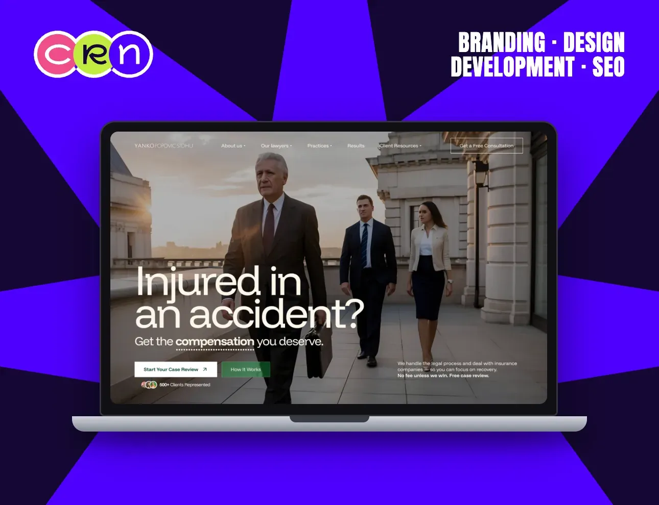
Show the standing, don't claim it
A personal-injury firm has a hard version of this problem: its visitors arrive in pain, in a hurry, and with every reason to distrust anyone promising them money.
The YPS homepage answers with a photograph: three lawyers walking out of a courthouse in evening light. Seniority, scale and seriousness, readable in about a second, without a word of self-description.
The alternative is the sentence every firm writes: “with over twenty years of combined experience”. It is the same claim, in the one form nobody believes, because anyone can type it.
Put the risk reversal where the doubt is
“No fee unless we win. Free case review.” On that homepage it sits above the fold, next to the button, not on a sub-page called Why Us, where it would be technically present and practically invisible.
That is the rule worth stealing: proof belongs beside the ask, not in a section named after itself. The objection and its answer should be readable in the same glance.
One caveat, and we hold ourselves to it. Publish only what you can show your working for. A statistic nobody can source reads as a statistic you invented, and a reader who doubts one number quietly discounts every other number on the page. It is why the cases on this site carry timelines and scope rather than borrowed percentages.
Questions we get asked
What are the most important trust signals on a website?
In order: an offer stated plainly enough that nobody has to assemble it, evidence you could show your working for, and a next step sized to how long the visitor has been on the page. Badges, seals and award logos come a long way after those, and none of them rescue a page failing the first three.
Do testimonials still work?
Specific ones do. A quote naming what was done, at what size, with what result, answers a real objection. Generic praise answers none, because it is what an unsatisfied client would also have said politely.
Where should trust signals go on a page?
Beside the ask, never in a section named after itself. The objection and its answer should be readable in the same glance — which is why a risk reversal belongs next to the button, not on a sub-page called Why Us.