Website redesign services
A new site that keeps what the old one earned: URLs, rankings and leads. Fixed price, live in about three weeks.
- 4.9/5 from 647 reviews
- 500+ websites since 2017
- Awwwards Honorable Mention
Our work
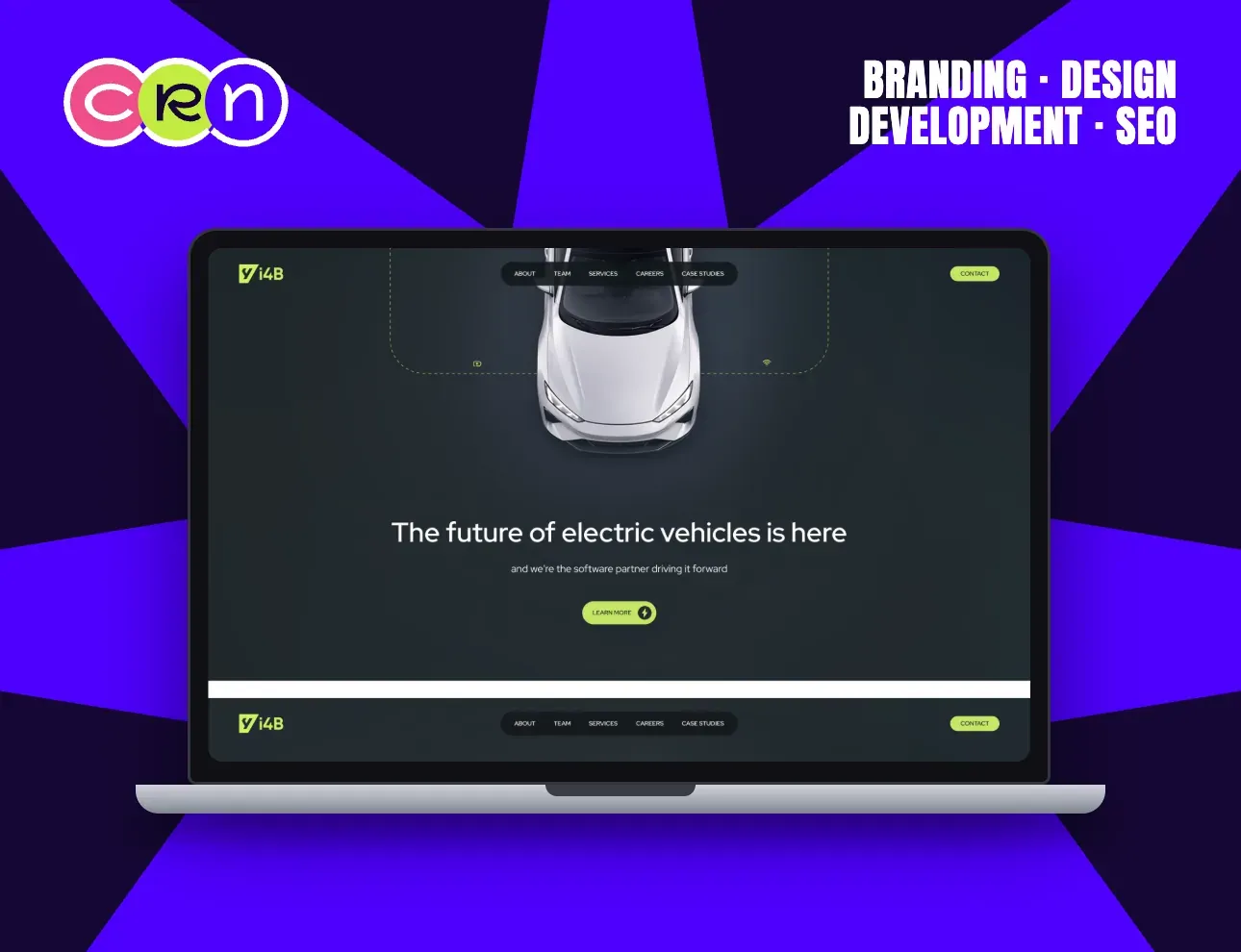
An engineering partner is hard to photograph. So the car is the picture, and the software is drawn around it.
The vehicle sits top-down in the dark; a dotted line traces a circuit around it, picking up sensor and connectivity marks as it goes. That single graphic says software partner faster than a page of copy.
Acid-lime on charcoal keeps the palette to two moves, so the CTA is the brightest thing on the page by construction.
The nav is the whole business in six words (about, team, services, careers, case studies, contact) and every one of them is a page a serious buyer will open.
View case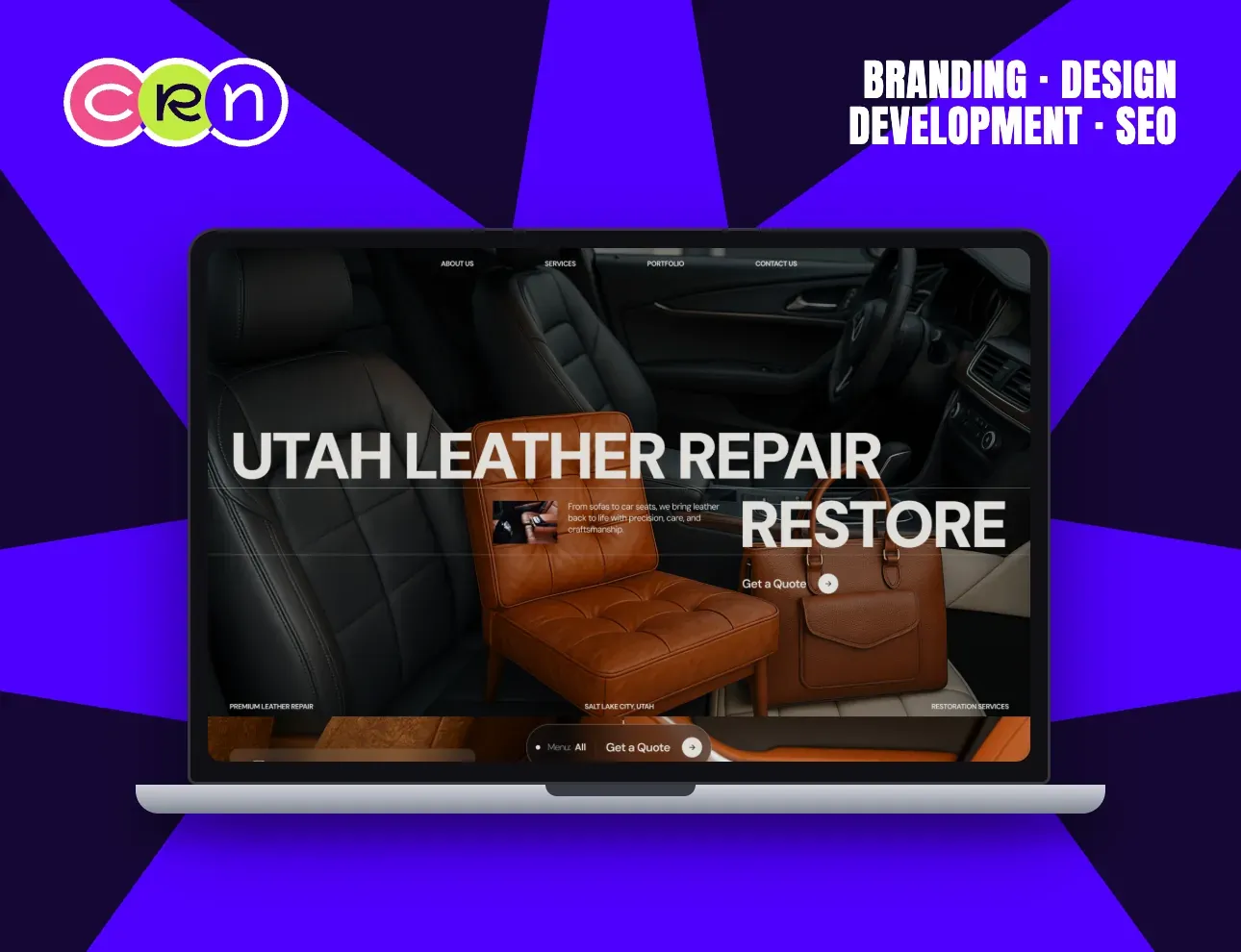
Restoration work only sells on evidence, so the whole hero is evidence.
Three pieces of leather sit in one frame (a car interior, an armchair, a briefcase) which is also the full range of the business, shown instead of listed.
The type layers over and behind the objects so the shot reads as one composition rather than a headline pasted on a photo.
Two anchors keep it local and concrete: Salt Lake City, Utah in the corner, and Get a Quote as the only thing to click.
View case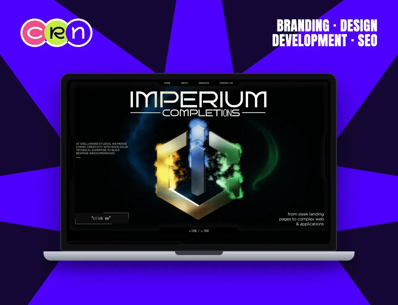
Digital completions is a hard service to picture, so the homepage had to show the standard of the work before it explained the method.
One object carries the hero: a metallic emblem suspended in a nebula, lit from four sides. Everything else on the screen gets out of its way: a thin nav, one paragraph, one invitation to click.
The dark palette is a working choice, not a mood. Against near-black, the artwork is the only thing with colour, so the eye has exactly one place to land.
Designed in Figma and built in Webflow: a cinematic preloader, an animated Attitude, Idea, Method story, the service pages and a multi-step contact form.
View case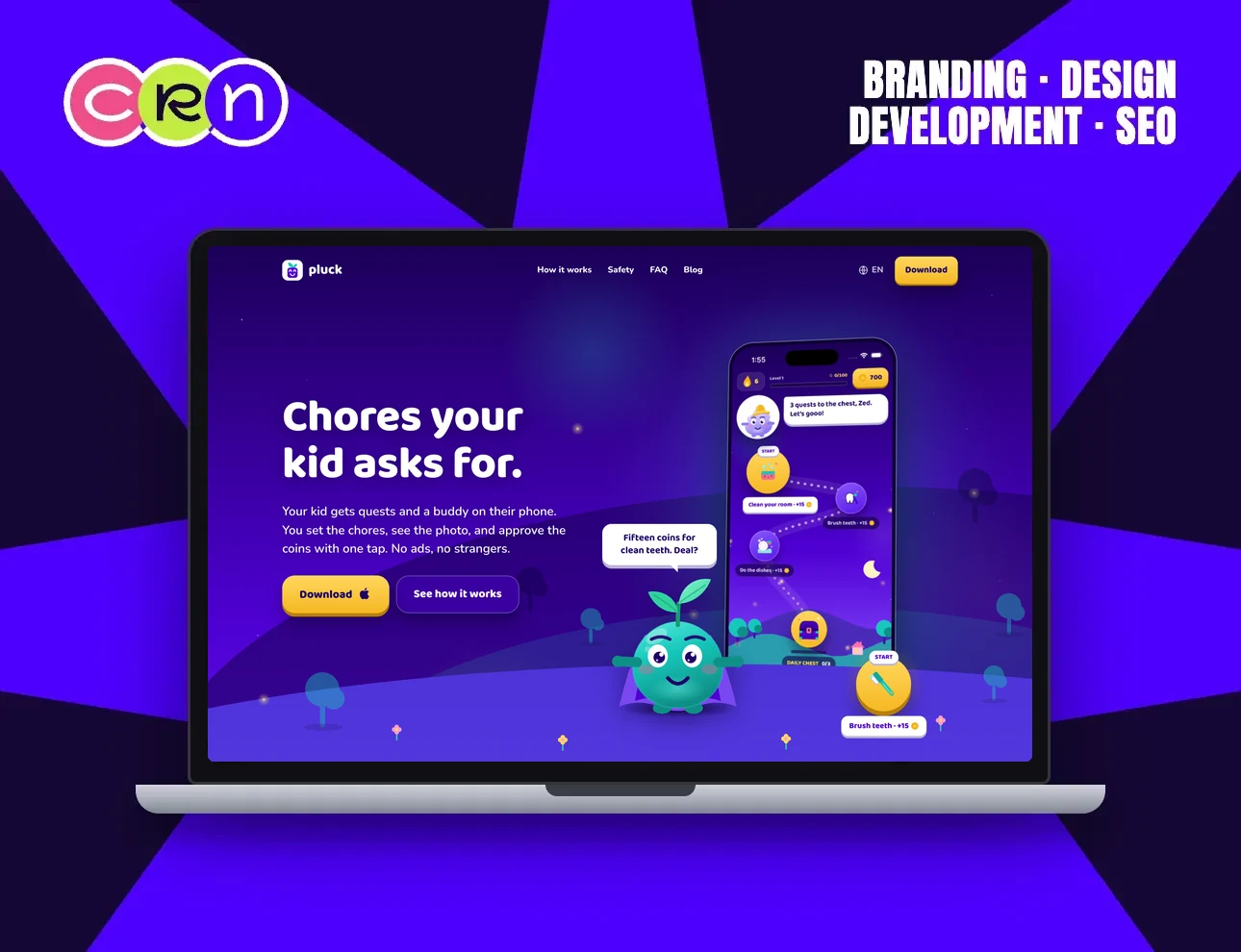
Chores apps usually end up as a checklist with stars on it, so Pluck had to be a world the kid opens without being asked.
The kid walks a map of quests with a buddy who calls them to the next one. The parent sets the chore, sees the photo and approves the coins with one tap.
Prizes come from the family's own shelf, like cinema on Friday or a trip to the park, and a big goal is counted in quest days, so saving is part of the game.
We branded it, designed both sides of the app, built it for the App Store and shipped the site in 16 languages.
View case
Most common
questions
Will a redesign hurt our Google rankings?
Not if the URLs are redirected and the content that ranks is kept.
We map every old address to its new one before launch and check Search Console after.How much does a website redesign cost?
From $1,000. What you already have makes it cheaper than a new build, and what you already rank for makes it more careful work.
You get a fixed price before we start.How long does a redesign take?
Most redesigns go live in about three weeks.
A large site with many pages to migrate takes longer, and you know the date before we start.Can you redesign our site and move it to a new platform?
Yes. A redesign is often the right moment to move off WordPress, Wix, Squarespace or Framer to a platform that fits better: Webflow, Shopify or a custom build.
What are the signs a website needs a redesign?
Visitors arrive and leave without acting, your team cannot update it, or it is slow on phones.
Looking dated alone is the weakest reason. We tell you if a fix is enough.
So… how do
we make you feel?
Choose your vibe, we’re listening.